Embrace the Denser Side: Layering Textures and Patterns | Web Design Trends of 2024
Table of contents

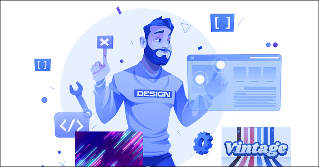
Web design has been dominated for years by minimalism – clean lines, flat colors, and a lot of white spaces. 2024, however, we see an audacious move towards a richer, more complex aesthetic. Think textured backgrounds, colorful patterns, and intricate details that combine to give an impression of websites that feel like immersive experiences.
This isn’t just throwing everything at the wall and hoping that it sticks. Instead, web design is about the art of visual complexity – the use of layers and patterns in a very calculated strategic manner to draw users in and tell a story.
Why the Shift?
As per custom web design Jacksonville experts, several factors are driving this move toward denser design:
- Attention fatigue: With infinite scrolling and information overkill, users desire websites that seek their pocket and stimulate their interest.
- Rise of storytelling: Brands understand the strength of emotional relationships, and multi-layered design offers a wonderful surface to tell stories and inspire certain feelings.
- Technological advancements: Faster load times and responsive browsers allow designers to go beyond the limit of visual complexity without compromising performance.
How Designers Are Embracing Density
Let’s explore some of the ways designers are playing with layers and patterns to create these immersive experiences:
- Textured backgrounds: On the other hand, subtle textures like grains, brushstrokes, or organic patterns can add depth and visual interest to the content without overpowering it.
- Overlapping elements: Layering text, images, and shapes provides a sense of depth, and hierarchy guiding users in the information.
- Bold use of patterns: Eye-catching patterns like geometric patterns, organic, or hand-drawn can add character and oomph to a website.
- Micro-interactions: So, subtle animations and hover effects help to make it more playful and make users interact with the website.
The Challenges and Considerations
While embracing density can be incredibly rewarding, it’s important to be mindful of potential pitfalls:
- Usability: Make sure that complexity does not sacrifice clarity and functionality. User experience should be given a higher priority; navigation and accessibility to content should be made easier.
- Performance: Big websites load slowly. Adjust and optimize images, implement caching strategies, and thoroughly test performance to ensure a seamless user experience.
- Accessibility: Do not depend on visual cues for critical information. Always provide alt text for images, make sure color contrast is appropriate, and think about users with visual disabilities.
Conclusion: You are better off Hugging the Canvas, not the Chaos.
Embracing density can turn websites into dynamic experiences, from just static pages. Remember to keep that balance between difficulty and simplicity, narration and utility, and aesthetics and usability.
So, are you prepared to leave minimalism behind and enter the thrilling world of multi-layered designs? Let’s use the canvas, not the chaos, and design websites that genuinely engage and resonate with users. Connect Jacksonville web design company today for a remarkable web design experience!


