Web Design Trends 2021
Table of contents
Technologies keep evolving and web design trends are no different. It too keeps constantly changing and heading towards attaining an edge over the old methods. Especially, in recent years there are dramatically remarkable changes in the web design sphere that some of you may even be experiencing now.
The old methods that were once modern and innovative are now overdone and cliché. However, if you still choose to stick around them and ignore the new critical design standards, you will end up losing a conversion. Outdated websites usually drive people away and this is of course the last thing you will ever want.
So, get ready to create a highly functional website that not only performs well but also looks fantastic by following the latest web design trends and our Jacksonville Website Design experts have listed them for you.
Have a look.
Minimalism
Generally, more is always good but when it comes to web design less is better. Here, quality trumps quantity. Simple and sophisticated web design attracts more customers as it simplifies the user experience. While too much use of elements, fonts, and images can ruin the look of the website as well as make it difficult for the viewers to find what they want. When designing a website, you should always aim to make the message clearer and not hidden. So many web designers have moved towards a minimalistic approach while designing a website. You can consider the main aspects of minimalism like hidden navigation, user-friendly interface, navigation space, creative font usage, usage of just three colors at the max, and avoiding excess details like color transitions, shadows, and textures. This trend not only aims to simplify your web design but also increases its usability and functionality. So, it is not here to quit any soon and will continue to be a key component of web design in the coming years too, according to a Website Design Company in Jacksonville.
Gradient color theme
Since the time when Instagram launched its gradient logo, this trend has been setting new standards of creativity. Gradients are eye-catching and they serve as a striking background by adding depth to it. There are hundreds of shades of color and gradients simply provide them in a unique way. This is why this trend is getting more and more popular now and is going to stay for long. Hence, making use of gradients will be a good option even with a minimalist design.
You can mostly see them used with bigger and bolder typography. Here are few tips you can follow to create gradients,
- Do not use any color you wish to use randomly. Make sure that the colors you choose serve the mood of a particular element of your product. If you don’t know what to pick, make use of the Adobe Color Wheel.
- Use colors like green, yellow, or blue that generally depicts nature. Every individual finds them attractive and seeing colors the viewers will surely be impressed.
- Make use of Gradient Color Generators like Color Space, Gradient Hunt, Web Gradients, Gradient, UI Gradients, and CSS Gradients. Here you just have to enter the code of the color and the tool will provide you with amazing eye-pleasing gradients which you can use for your website.
This trend has staying power according to the results derived from polls and expert comments, thus proving it to be the best trend of 2021. Hence, make sure to use it smartly while designing your website.
Dark mode
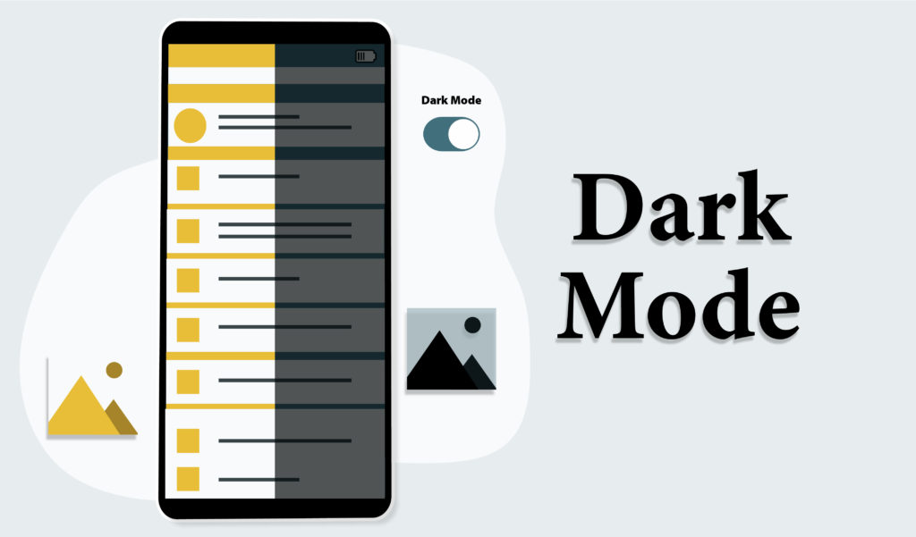
The dark mode is one of the hottest web design trends present in 2021. It is a great way to add a modern and elegant touch to your website. It gives you the ability to highlight your important elements by darkening the other elements that surround them thus making them more visible. Besides a sleek and chic look, it also provides users with a low-contrast site that helps to reduce their eye strain, which is a major concern of many. Thus, making it easier to look at the screen which ultimately increases the user’s time spent on the screen. Even studies show that dark mode is great for our vision as it reduces blue light exposure. In fact, this technology is even used by big brands like Apple, and Hublot. So, this is definitely a trend that creates a huge impact on your website. Most importantly, here you can allow your visitors to customize their own user experience by adding a dark mode toggle which will allow the users to switch between the light and dark mode. Hence, more and more designers are reverting to dark mode, and looking at its popularity you should too.
Here are some tips to make the best use of the dark mode trend.
- Avoid highly saturated colors on dark backgrounds.
- Use light and dark color variation to establish hierarchy.
- You don’t need to compulsory make use of white and black colors in dark mode.
- A pale gray on a dark purple background will also do.
- Make sure to include a toggle switch for light or dark mode to allow your users to choose how to look at the design.
Availability, Inclusivity, and Accessibility
Highly functional websites have been always in demand for years. In fact, it has been a key aspect of every website design. However, now inclusivity, availability, and accessibility are gaining more focus along with fast load times, page speed, and responsive design in order to make websites that are accessible and functional for all. This will help to factor in the needs of people with disabilities. Thus, many brands today are adopting this trend and focusing on having an accessible and user-friendly website for all their users. So that they can provide an effective online experience by allowing every visitor to easily navigate their website.
Here are tips through which you can make your website more inclusive and accessible.
- Create a strong color contrast between your background and text.
- Add focus indicators like rectangular outlines to show up around links while using keyboard navigation.
- Make use of functional alt tags for images.
- Don’t use low-context placeholder text instead include labels and instructions with form field.
This will help you increase your conversion rate, boost your SEO, and reach a bigger audience.
Motion
Many of us already know that video is the most engaging form of content today. So, it will be no surprise to hear that motion is trending in web design now. You can add small animations that add subtle feedback to the users.
You may have already seen the link change its color when we hover over it. In this same way, you can stand out a little bit more by giving more attention to such micro-interactions. For example, animating small elements when the cursor hovers over it.
These animations can also be extremely helpful to guide users through their interactions with your website. Plus, they will also add an element of playfulness to your website.
Interactivity
In addition to motion, interactivity plays an important role in the online experience and is a great way to engage your visitors. Additionally, it also allows you to learn more about them. In fact, business is all about gaining customers and interactivity can help you gain them. Hence, this trend has become of prominent importance in 2021.
You can already see many businesses and brands adding interactive elements such as quizzes, games, polls, contests, and surveys. So, you should too. This not only engages users but also provides them value.
3D interactive images
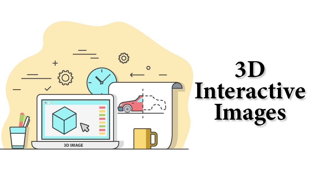
This trend is most popular amongst e-commerce businesses. Many people usually are less comfortable with online shopping and find buying products online as the biggest challenge for them. Because they don’t know how the product exactly looks in real life. Here is where 3D and interactive images can be of great help. It can help provide a visual solution for this very caveat. This is why many businesses have started using 3d simulations.
Users find them to be captivating, engaging, and exciting. These 3D images enhance the user experience and give them the taste of their products.
Illustrations
The website can seem generic and bland sometimes with the same stock of photos. However, the use of custom illustrations can help your website stand out from the crowd. These illustrations feel like something fresh to your website visitors and are fun, engaging, and kind of related to their mood. They spark the emotion of joy in the users and are a vibrant and awesome form of communication.
By implementing this trend in your website, you can combine the message clarity of graphic design and the expressive capacity of fine arts. In simple words, illustrations can portray a message clearly that photography can’t. Hence, they are absolutely exploded this year, and plenty of brands and creators are greatly using them to add a crafty, authentic touch to their website.
You can find multiple resources like Humaaans, Drawkit, Avataaars, Freeillustration, Blush, Open Doodles, Stubborngenerator for illustrations. In fact, many brands are already experimenting and using an illustration from 2020 and it is on the list of web design trends in 2021 as well. So, make sure to make use of illustrations on your website too.
To focus your efforts towards creating diversity, you can feature quirky illustrations that include people of all shapes and sizes.
Big, Bold Typography
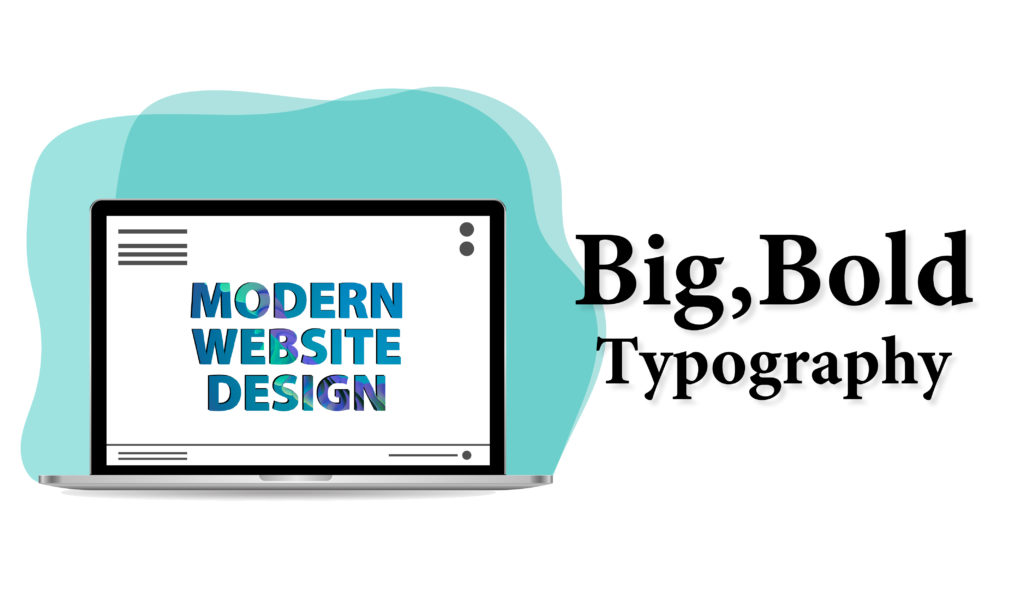
Another big trend that headed into 2021 is big and bold typography as it is believed that the bigger the letters, the more impact they can create. This trend works the best in the above-the-fold area where there are few words that focus on your company’s slogan and are easy to read and understand. The font style doesn’t matter much here, it is only the size that makes this font work and the good news is you use this trend on flat backgrounds, images, or anywhere where the text stands alone.
Here are some tips for using big and bold fonts:
- Decide whether your text should be readable or artistic, if you with making it artistic, make sure that you include a secondary readable option there.
- Don’t add too much element in the background and keep it simple to drive focus on the text.
- Remember to make your text responsive by considering how big it will look in vertical spaces or on small screens.
- Don’t overwhelm users with too many words and letters, keep them to a minimum.
Circles
Designing with geometry has been trending for a few years, but now circles are emerging as the most favorite shape in this trend and are gaining a lot of popularity in 2021. Well, the one reason that we as a website design company think for this is the implied meanings of a circle such as wholeness, perfection, and infinity. Or else, designers maybe just using it because they really bring visual focus on certain areas of design.
Even you might have noticed how our eyes are immediately drawn towards circular areas as they really contrast well with the rest of the design. So, get ready to set your website with the new trends.
Everyone in 2021 is drawn towards eye-catching, captivating, bright, and clean websites, and these trends will help you make your website like one. The aforementioned trends will not only help you design a user-friendly and modern website but also positively influence your brand.
However, none of these trends will work in isolation, it will be better to develop and design them as a part of a thoughtful and intentional design scheme. You can figure out and note down, how many of these trends overlap with one another and build a website with some of them. For instance, your website can also contain dark mode with big and bold typography on a gradient background. Plus, also include circles in your design. This versatility makes these design trends highly valuable, layer-able, and perfect for your next project. So, get ready to showcase your creativity and ideas in a new way while designing a website and have fun.

