What are the Elements Present in a Good Ecommerce Website?
Table of contents
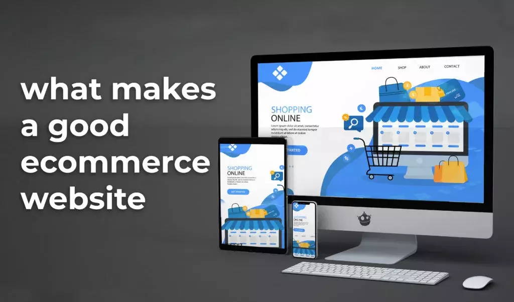
E-commerce websites are online portals that help you to buy and sell tangible goods, digital products, or services online. For businesses, their website is the main point of contact between buyers and sellers. Nowadays many people do most of their shopping from online sites. This means that having a visually pleasing and user-friendly website can offer a new platform to your business. Depending on your niche and industry, having the option for customers to buy your products directly from your website can be vital to ensure that you don’t miss out on customs or fall behind competitors who are already offering the same product. Because of the digital revolution, people now expect good services in less time, so if your website is slow or difficult to navigate, you may lose customers. That’s why a good e-commerce website design is very important. These websites are built in such a way that they attract consumers seeking your goods and services; they can easily find what they are looking for, content that compels them to buy, and at a point-of-sale process they can trust to complete the financial transaction safely. With an e-commerce site, potential customers can reach you from anywhere, and at any time. But if your e-commerce site isn’t set up properly, it won’t attract or engage visitors enough to increase brand recognition and keep them coming back. To stay competitive every e-commerce website should have certain elements. And we at YashaaGlobal, a company with web design Jacksonville services have come up with some must-have features to make a good e-commerce website.
User friendly:
With everyone getting into online sales, having a user-friendly e-commerce site is a must to maintain your web presence strong and profitable. We all know, simplicity should be a priority in good website design, but you don’t need to sacrifice elegance to achieve it. Studies show that 76% of customers say that the most important aspect of a website is the ease of use. So the business’s goal is to help customers get what they want quickly and without running into needless complexity that can clog up the path to purchase. Online sellers have minutes to make a sale. So, you should focus on the user experience by providing filters, shopping categories, and comparison capabilities. To make a good e-commerce website you can also refer to things successful websites have in common.
Mobile-Friendly:
Nowadays a large number of users shop online from their mobile devices. You should optimize your website for mobile devices to give a pleasant experience to visitors. Responsive design can make your e-commerce website more user-friendly. With a responsive website, content intuitively fits any device that is accessing it to provide a user-friendly experience. It doesn’t matter how many pages you have, a responsive website is always the best option for you. Creating a mobile-friendly experience for your customers will increase revenue and probably your rankings. Visitors should be able to easily access all of the important features, offers, and products on your mobile site. You can also approach a web design company for getting a mobile-friendly website.
High-quality photos and videos
A thousand words are expressed by a single picture. Actually, it’s true for e-commerce websites. Product images help users create their first impression of your product. Product images can either attract customers or turn them away. Would you trust a store that doesn’t photograph its products properly?
When customers purchase online, they can’t see, touch, or try your products like they can in a physical store. So by looking at the product photos, the customers decide whether to buy it or not. And if your product pictures are too small, pixelated, or there is only one picture of a product, will it inspire people to buy the product? Probably not. That’s why you should work in high-quality product photography to properly present your product. Because customers who shop online want to see how the product actually looks and also prefer to see multiple images of a product before making a purchase. You can also include a detailed description or video that highlights all of the important features of your product. It would be better if you could provide a few in-context or lifestyle pictures of your product. Using high-quality photographs should not be limited to single product pages. You should also focus on improving the quality of category page images. High-quality and impressive images attract users to click on individual pages and browse through them. The more pages they visit, the more their chances of conversion.
Ratings and reviews

A significant e-commerce website is a kind of collaboration between website owners, customers, and managers. It’s not just a shopping platform but, it’s like a community. Customers purchase products, share their views with others, and give recommendations. We all know that the word of mouth always works better than any advertising. But some website owners avoid adding rating and commenting options. They are afraid that customers will write negative reviews. Of course, a disappointed customer is much more likely to write a negative review, than a satisfied customer. Writing a review is time-consuming and you must have a good reason to spend your time on it. If you don’t think you are ready to add the review feature, at least go for the rating option. This is also an important feature. Almost 57% of customers will only buy a product if it has 4 or more stars. You can create handy filters by using the submitted rating. Customers can quickly pick the products with a high rating. Since rating the product does not take a long time, it needs less motivation. But if you decide to use the comments option, there are a few ways to encourage satisfied customers for writing reviews:
- You can ask them directly for reviews in the follow-up email after the purchase.
- You can offer some discounts to the most active customers.
Clear design and easy navigation
The success of an online business is majorly dependent on its website design. In fact, many people determine the credibility of a store by its website design. Make a list of your shop categories and well-structured your online store. Poorly structured websites don’t perform well; they put more elements on a web page, which distract customers from the main purpose of the store. Removing non-essential elements can help you draw your customer’s attention to the important elements of your site.
Work with your web designer to figure out how to categorize your products. Make sure your navigation is simple and easy to understand for your customers. Perform user testing to determine the best labels for your navigation. Ensuring your website has a user-friendly interface that runs on all devices is key to increasing conversions. Do user testing and set conversion goals, to monitor how your website is doing. A minimalistic website would also load quicker, which can help you decrease bounce rates and engage more customers. A minimalistic website design with a simple color scheme and elegant typography can look attractive for longer. So, if you want to increase the conversions of your store, you should keep it simple because clean and simple e-commerce website designs are always better.
Detailed Product Descriptions
While online shopping, a clear and accurate description of your product is important to help customers make the decision to purchase. Your descriptions act like the store’s salesperson so they must be informative and have the right tone for your target audience. They should cover the all features of your products and effectively convey the value your product can provide. The description includes information about warranties, colors, clothing size, texture, dimensions, materials, or fabric used.
Many people visit e-commerce websites just to see stuff. But if your product has a great description it will keep them engaged on the website, a well-timed pop-up can push them toward the checkout. In a pop-up, you can display products that your visitors browsed or wish-list. To increase conversions add dynamic content such as a limited-time discount or bundled deals. Use pop-up builder tools to get the proper pop-up content, and target the right audience. Include an FAQ section too, to solve the doubts of customers about your products. Capture the customer’s imagination and be creative with your product details. Appeal to your customer’s emotions by demonstrating the benefits of your product and how it will make their life better.
Detailed shipping information
The most common reason for shopping cart abandonment is unexpected shipping costs. Early in the checkout process, e-commerce websites must provide shipping details, including a ZIP code calculator that shows the cost. It’s also a smart option to mention delivery time and faster delivery options. Countries that are outside of usual shipping zones should be listed on websites. Most customers like to shop when free shipping is available. Be sure to include free shipping on all pages of the website through the header navigation, if applicable. Mostly, it is advisable to add a delivery option at the top of your webpage; it is most commonly pinned to the page header.
It is particularly important to provide complete details about the varying shipping costs based on the different geological locations. Customers get disappointed when they find out that delivery isn’t available at their location. If you provide free delivery, always mention it on the home page. To attract more customers to your site, the best strategy is to have a completely free delivery service.
Easy Checkout Process
Your checkout process may be the biggest conversion killer for your online store. If your checkout is poorly planned or built, you might potentially lose up to 67 % of your customers. If possible keep the checkout process to one page. The most functional websites avoid frustrating customers who will either leave your site or make their purchase but do not return. This is one of the most important aspects of an e-commerce website. You should focus on providing a great checkout experience to your customers. Adding products to the shopping carts and proceeding to the checkout page should be easy for customers. Don’t confuse your customers during checkout. They should be able to see what they have in their cart.
Make your design as simple as possible. Give customers an easy checkout process with features like multiple payment options, guest checkout options, and easy form-filling. Your checkout page speed should be as fast as possible so users would easily purchase the products. Improving your checkout experience can help you increase your customer retention rate and encourage more sales in the future. Showing other product recommendations during the checkout process can distract customers and keep them away from completing their purchases. To provide a good checkout experience, you must strike a balance between good functionality, usability, and building trust.
- Have a big and eye-catching ‘checkout’ button
- Do not show unexpected costs at checkout
- Optimize your site for load time, and make sure that it’s mobile-friendly
- Make it easy to change the items on the cart
- Show pictures of the products in the shopping cart
- Keep your checkout clear and clutter-free
- Make the contact process easy
Every online store’s website is different. There is no final interface solution. So, you should always consider what your company needs in the first place. However, there are some important features you could use to make a good e-commerce website. Always remember to integrate them into your design.
- Your e-commerce website design should be clear and simple. Customers should feel comfortable on your website. The navigation should be clear and easy to operate. Any information should be easily available.
- You should provide specific details about your products. Also include pictures, descriptions, videos, and zoom options. The more details users get, the more likely they are to purchase a product.
- Create a personal account page for users. Save their last orders, allow them to create wish lists, and save items in the cart for later. Customers like to have everything at hand.
- Provide detailed information on the delivery process. Also, provide offers and discounts. Don’t forget about the terms and conditions. Describe payment methods, shipping process, and return and exchange policy.
- Add feedback and rating and review options. Allow your customers to contact you, ask questions and share feedback. This way you will make them feel special.
- Add categories of different products. Update your website regularly. Your customers will come back if they have a good experience with you.
Website speed is an effective factor that can affect your website performance, a good e-commerce website with slow loading can result in losing leads. So having good website speed is essential, we have mentioned some ways through which you can speed up your website and have a better performance.

